Q4- How did you use new media technologies in the construction and research, planning and evaluation stages?
+ GROUP VIDEO
USES OF TECHNOLOGY: - DSLR (CANON 650 D) - FINAL CUT PRO - ADOBE PHOTOSHOP - MOJIPIC - iMAC - YOUTUBE - SOCIAL MEDIA SITES (INSTAGRAM, FACEBOOK, TWITTER) - PREZI - SLIDESHARE - MICROSOFT EXCEL TO RECORD INFORMATION - BLOGGER - iPHONE
PROS:
- The DSLR camera was of a very high quality but not very practical to carry around as we had to take very good care of it, and also not lose it due to how expensive it. We also had to carry it around our shoulders the whole time whilst shooting, so that we don't drop it, however this did become very impractical as it limited the flexibility of our hands to move the camera around to get the shots that we wanted.
1. In what ways does your media products use, develop or challenge forms and conventions of real media products?
CONVENTIONS OF THEPOPGENRE:
MISE-EN-SCENE (Visual Motifs)
Big locations, mainstream & fashionable outfits, props that link with the lyric or vibrant colours scene in each shot whether through makeup or lighting.
JAYWALK
LOCATION
The locations that were chosen to create my music video are very contrasting. Therefore, I was able to work with a collection of scenes with lots of greenery, lights and a busy city. I found that this variety of different locations helped create the vibrant and energetic ambiance that is seen in the pop genre.
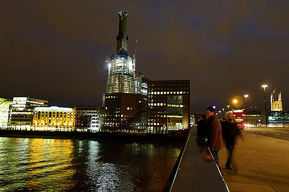
LONDON BRIDGE
A very vibrant and busy atmosphere. With the constant changing of the backdrop and busy people traveling behind; it creates the perfect lively mood for the genre.
SKATEBOARDING
LIGHTING
The lighting we used in our music video, (the shot which was done in class), is similar to the shot in 'I don't want to live forever', suggesting that all pop videos use the flashing lights in their music video. The reason we has used lights was because it gave a a good sense of pop music allowing it to conform to its genre.
SUBVERTING THE POP GENRE CONVENTIONS
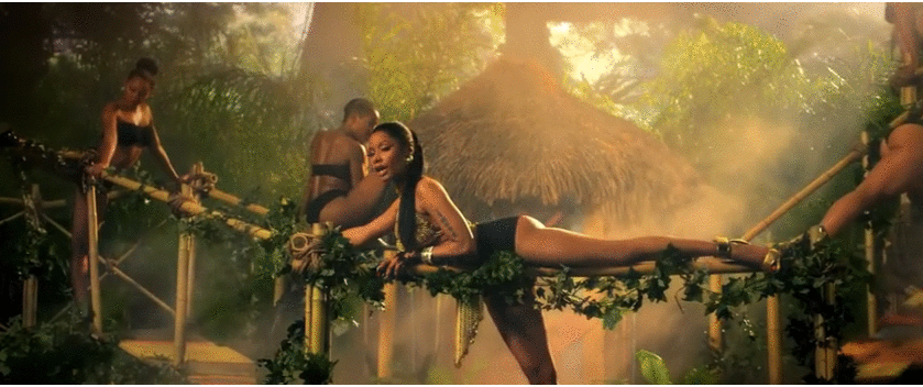
1) A convention seen in many pop genre videos is the notion of the 'male gaze' on women.
In my music video, I did not include this as I wanted it to represent teen life full of enjoyment and energy and to invite the audience to feel this vibe.
These are examples of pop artists that included voyeurism in their music videos...
Katy Perry - California Gurls
Miley Cyrus - We Can't Stop
Nicki Minaj - Anaconda
ANCILLARY TEXTS
Digipak:
Magazine Advert:
The pop genre has a typically a very lively and energetic ambiance, therefore, it was crucial for my advert to include clear, bold fonts and color as well as my digipak, I also added he same picture for a synergistic element.
FONT AND DESIGN
Keeping the fonts and colours of the text the same for the entire digipak was important to make my digipak look professional whilst still conforming to the genre of our music.
IMAGE CHOICE
In most of my digipak photos, the location shots and any photos without the 'artist' is edited to the similar filter where the image is grained. Also, in contrast to this, I wanted the text to stand out from the photograph so that it would be easily read.
Q1- In what way does your product use develop or challenge forms and conventions of real media products?
Through my research i have found many different conventions of music videos in general. Goodwin's theory, explained many conventions that fall under the majority of music videos today. However, I have found other conventions of what tends to be involved in music videos.
- There is a relationship between the visuals and lyrics We based our whole narrative around the lyrics, however, the lyrics do not give a clear story but give suggestions for what may have happened, allowing us to be creative with constructing the narrative. Our narrative follows the main singer story; reminiscing on the toxic relationship which has left him low and reminiscing over the future, this has also lead to him taking a journey, lines such as: "now I cant see tomorrow?" "you've got to jaywalk" "whos said that I, I don't deserve to move on'?"
Brayton Bowmen is the artist of jaywalk , Brayton prides him self in his soulful pop music and his blunt rolling. Brayton States he's ' inspired by: Amy Winehouse, Stevie wonder & people that thrive in the face of adversity.' the fact that Brayton is inspired from people of all genres but practically the soul and R'n'B genre shows what type of music he creates and that's what I wanted to show during the creation of his music video, a artist that perform pop but still has the raw soul in the song , the song jaywalk resonates with a few audiences from a younger pop degenerate to a older mature R'n'B audience. One artist that has helped me in the creation of a real music video was Sam Smith in particular the song not the only one , whilst the song is recognised as a chart toping pop song many see the soul and passion that is often associated in the R'n'B genre and the music video especially get the same vibe with the passion being felt at many different parts by different audiences. Brayton states on his website, 'I SOUND LIKE MY SELF. WE CAN CALL IT 90S-R&B-INFLUNCED ELECTRONIC MUSIC IF YOU WANT... BUT I MAKE POP MUSIC. JUST NOT THE KIND YOU'RE USED TO' this also support the choices of the inspiration of the music videos I used for help of the real media product.
to make sure our product stood out from most music videos we gave it a restricted narrative this helped us , challenge a create a different aspect to a music video other than its full story , in three minutes, we also only had one person in the music video to create a sense of loneliness and entrapment, through and off the screen, with the video the actor has no one and the lyrics suggest explicitly that he was in a toxic and unhealthy relationship, we see the actor lip singing in a location with a black ground to make in more intense and personal to create a sense of realism so the audience can resonate with the lyrics and feel the authenticity , so the video seemed like a real media product.
this shot is a comparison of real media text that have received over20million view on YouTube this shot emulates pain and evokes sympathy from the audience trying to reconstruct the same shot in a different environment proved t o be tricky at time but it worked eventually and help create further connection between the products and the audience
In what way does your product use develop or challenge forms and conventions of real media products? 1- In the video:
The final product, with commentary:
Videos that inspired us:
Below are real media texts which had inspired our own production, through camera shots and angles and shot composition, lighting and colour and costume.
A simple costume can be seen in these videos, confirming our choice about a plain white t-shirt and black jeans.
LOCATION: The use of a skate-park as one of our locations came up in the initial stages of planning, we thought it would appeal to a younger demographic while simultaneously the graffiti would give an urban vibe and reflect the funk and r&b beats in our song of choice. Thereby adhering to conventions of the R&B genre but not conventionally to pop. -However for Justin Bieber's song 'What Do You Mean' the location of a skatepark is also used; depicted as an underground adolescent hang out.
LIGHTING:
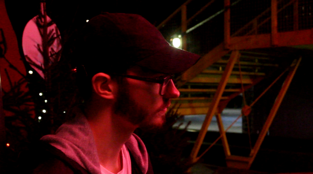
While it could seem as if we're keeping away from a conventional pop video as far as lighting is concerned, due to the dimly lit visuals with lingering neons, these conventions perhaps being more fitting with an alternative or rock genre however I did find pop videos which included these elements. In the video for 'I don't want to live forever' the use of colour and lighting is exploited to make the video look effective. There is a generally darker tone to the video which parallels our own shots; in the real media text this is used to give the video a mysterious element (taking in mind that it's part of the sound track for the new fifty shades of grey sequel) in our video however we use low lit shots to contrast with the bright morning shots and shots with neon lights; the contrast being symbolic of the persona's contrasting emotions. This video also parallels with our one through the use of a colour tint where in the real media text it is created through lighting and enhanced in post-production. We liked the idea of coloured lights influencing the image, seeing as colour is one of the fundamental conventions of a pop video. We used coloured light both in exterior filming with the pink light construction in Waterloo, as well as during interior filming with flashing red lights.
In the video for 'I don't want to live forever' the artists are lit with flashing red and blue lights, this can be seen as implying a sense of danger through the connotations of red, but also through the blue and red signals of police lights. In our video we use the flashing red lights to create a sense of warning; the persona in the song needs to force himself to make the right choice in walking away from the relationship, furthermore the red light links with red traffic lights which ties in with the idea of 'Jaywalking', pivotal to the song.
The same sort of atmosphere with a night setting and neon lights can be seen in Justin Bieber's video for 'What do you mean'. We liked the overall aesthetic look of the neon lights and knew that a pop industry is very much about the way things look, with arguably an even larger focus on artist's image than sound, so the look of the video was important for us.
The videos for Coldplay's 'The Scientist' and Sam Smith's 'I'm not the Only one' utilise natural lighting, giving the video a fresher look, I followed this approach in the first scene of our video where the story re-winds to show the persona in the morning.
CAMERA SHOTS, ANGLES AND MOVEMENT AND EDITING: Coldplay's 'The Scientist' and Sam Smith's 'I'm not the Only one' largely influenced our ideas of shots in initial stages of planning. The video for 'The Scientist' is recorded backwards, something that I found really effective. Knowing that this had grabbed by attention I wanted to apply a similar shot in our video. This is done in the first scene after the opening when the clothes are being thrown out of the window. By applying the reverse effect (in final cut pro) the recorded footage is played backwards so the falling clothes are collected of the floor and fly back up. -This can be interpreted as a want to re-wind time and have another shot at the relationship that has fallen apart, but through the way that the persona sits on the floor, untouched by what is happening behind him- almost incongruous, it gives off a more complex idea of his inner turmoil. -He simultaneously looks stoic and regretful and this theme of contrasts is kept out throughout in our product, as mentioned before with the lighting.
I was also inspired by 'The Scientist' and Sam Smith's 'I'm Not the Only One' when the two video's simple shots are concerned. The tracking shots of the artist walking is something that I found simple but effective and professional looking, therefore applied it to my own product.
CONCEPT:
My video portrays a reflection; the persona is seen at night at the beginning of the video but earlier action is established right after the intro of the song in the form of a flashback showing the persona being kicked out by his partner. While conventionally this would include a cliche scene of an argument between a male and female I decided to avoid this, both to avoid the cliche and to challenge the convention of a straight relationship seeing as our artist of choice, 'Brayton Bowman' is homosexual. - The partner is unnamed and remains invisible but through the figure expression of our actor and location, we can infer that he has been kicked out or 'kicked to the curb' as the lyrics state. However the stark concept of a flashback is conventional across all genres, with pop in particular. (below: A fragment of Adele's 'Hello' which includes a flashback)
The initial step I took in creating the magazine advert and DigiPak was to look at real media products of this sort.
The main conventions I had noticed were:
Synergy with album or one of the single's music videos
A title- largest element- standing out
A release date
Platforms of release; CD? Download? Vinyl?
Record company
Webiste URL
Social Media information
Thereby I knew to include all these conventions in my own product to make it look professional and more like a genuine magazine advert for an album.
________________________________________________________ 3- In the Digi-Pak
THE LOGO:
I created a logo for 'our' 'record company' in a software called 'logo- maker'. Taking a look at real Record Label logos we realised that they are mainly simple and mainly in black and white and so adhered to this convention.
We knew the importance of audience feedback when it comes to media product creation so sought advice even at this stage, allowing our friends and colleagues to vote on the logo they preferred with the options as follows:
Some feedback we received:
'Number 3 looks a bit more like a film production company rather than a record company'
'1 is subtle and looks professional like a real logo'
'It looks more authentic with the text all on one line, but I'm not too keen on the font of 4 so definitely between 5 and 1'
We went with the majority favourite number 1.
The next necessary element to pair with the logo was the copyright information. I viewed other CD's copyright information and altered it to fit our label to gain the most authentic look:
The positioning of this information on the back of the CD was debatable, conventionally it is located at the bottom however i placed it to the side in my design, following the look of a 'The Who' CD i own.
THE NAME OF THE ALBUM:
I felt that the most appropriate choice would be to go for an eponymous/self-titled album; many artists' albums are named after them; especially first time releases. Considering this would be our artist's first album release it would be appropriate that the album was named after him, this is an effective way of getting an artist's name 'out there'.
Some examples of self-titled albums:
An initial idea of an eponymous album:
I based the copyright information text on that of a real product; namely the back of a 'The Who' CD.
After having sought audience feedback, my friend advised that I add the album title to the CD design this is an adherence to real media products; having the album title on the CD allows for easier use; the CD won't be misplaced.
I decided to use Brayton's real lyrics considering the fact that he has multiple soundcloud releases. i had expected a few to be typed up on the internet (Jaywalk was) but thought I'd have to listen to some carefully to note the lyrics, however the lyrics to all the songs I had listed on the back cover of my digi-pak were easily located on the internet:
(above are two examples of the lyrics)
It was important to make sure that all the lyrics are in order of the songs on the album; this is a convention of digi-paks which makes it easier for the user to navigate.
The final set up I decided on for the digi-pak lyric booklet was:
A brief presentation outlining the way we combined our products- these being:
The Music Video
The DigiPak
The Magazine Advert
How we decided on the manner of combination:
To establish this link between our combination of main and ancillary texts we made sure to look into real media texts and note how other established artists interweave themes and concepts between their different media texts to create synergy in their effective marketing campaigns.
EXAMPLE 1: The most recent Arctic Monkey's Album 'AM' is one that has become widely recognisable not just because of its musical content but indeed due to the synergistic element of the marketing campaign: The wavelength logo; or more accurately the 'amplitude modulated' (giving the initials AM which also overlap the band name initials) permeates the campaign ....from video:
..to: DigiPak:
To Magazine Adverts :
...Thus rendering it an effective synergistic campaign where the effect can be seen through both its critical acclaim, and audience reception being number 1 in over 16 countries. = Knowing this we got the impression that synergy is effective and thus important as part of the 'promotional package' for our chosen artist. EXAMPLE 2: Synergy is also explicit in the marketing campaign for The Black Key's most recent album 'Turning Blue' where the electric blue and pink are cardinal elements. The DigiPak doesn't include many elements but this cover with the contrasting, or even clashing, colours renders it vibrant and catches the eye of the consumer who have to come closer to read the inner grey circle where the artist's [band's] name is printed. Meanwhile the parallel of the blue background and the title 'turn blue' underlines this certain significance of the element which the consumer will only excavate if they purchase the album.
The single which promoted the album featured the same design depicted on the digipak so if any potential consumers came across the song on YouTube (and enjoyed it) they could easily draw a parallel if they were to see the digipak in store.
EXAMPLE 3: Adele's debut album followed the same synergistic pattern, here with an application of a black and white effect for the digiPak, advert and video ('Someone Like You')
In a parallel to Brayton Bowman, our chosen artist, this was her debut album which ended up setting up her successful and fruitful career. This confirmed that synergy is effective for the promotional campaign of a rising artist.