The photo on THE FRONT COVER includes a block of council houses; an estate in the night with all lights switched off. The darkness matches the idea of a 'nightmare'. Heightened by the contrasting psychedelic murals within.
Front-man Alex Turner (speaking of the album art work said:
“We wanted to do something physical, like do something real with the artwork. We got all these illustrators, played them some tunes and that and got them to draw bits of stuff, bits of things that we liked and stuff."
"The idea was to get a house or a factory that looks really plain and bland, dark satanic mills or whatever, and then inside there’s all this colour."
THE LOGO differs from the original logo of the band, maybe this is because at this point, following the success of their first album: 'Whatever People Say I Am That's What I'm Not' and the controversy of that album cover, the band had become an established one allowing themselves to make changes like this.
The yellow colours of the logo and album name in a weird quirky font stand out from the background making it not only more visible but also perhaps mirroring the band themselves; depicting them as quirky.
The psychedelic patterns within the interior could be a representation of the edgy and specific sound the Arctic Monkeys have.
THE INSIDE COVERS show different angles of the art work construction (whereabouts the house has had it's walls torn to reveal its painted interior in a graffiti style).

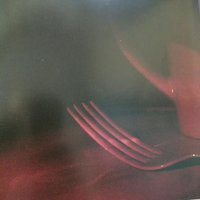
THE BOOKLET within the CD pack contains a compilation of distorted close up photos, which have been edited with different colour tints. This strange look can be seen as a parallel for the alternative genre of the band.
THE BACK COVER is simple and black with a thin bar code in the left bottom corner and product information along wit the Domino records production logo to the side.
In contrast to the front covers and inside the back panel is minimalistic but carries the same elements as the other panels with the yellow writing giving the digipak continuity.


No comments:
Post a Comment